We’re now mid-way through our 5 part blog series. Today we’re here with blog 3: navigation and CTAs (calls to action). This blog will feature how to create the best user-experience and drive the user to buy. In summary, the takeaway message is simplification. Web visitors should navigate your website with ease and have organic opportunities to buy throughout. We will show you how we achieve this for our clients.
What do we mean by navigation and CTAs?
These are broad terms that describe the general user experience on the website. Navigation refers to how easily the user can find what they’re looking for on your website. CTA stands for ‘call to action’. CTAs can refer to a variety of methods that direct the user into taking action. For instance, this is usually directing the client to buy or enquire. However, it could also mean reading information or signing up to receive your newsletter. Essentially anything that requires the user to physically act by clicking on a prompt.
Navigation
Wireframes and menus
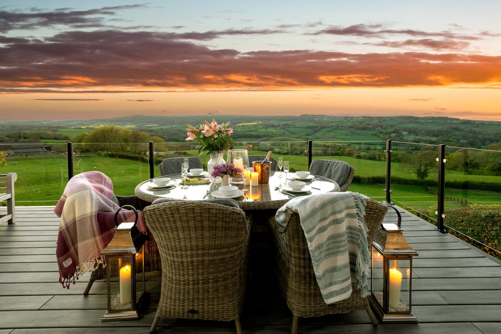
A wireframe is the basic outline of your website. Read more about wireframes here. The menu is what allows users to click between sections of your website. Sometimes the menu can be found on the left or right hand side, but generally it’s at the top. The picture below is an example of a menu on a website we recently created for Patson Hill Farm.

Grab a notepad and jot down what’s important to you and your customers or guests. Whether you’re DIYing your website, or hiring a professional, you must decide what needs to be showcased on your website. Think about what visitors to your website need to know to be confident to click ‘book now’ or ‘buy’. Write down as many answers as you can think of, then highlight the important things. You should aim to have roughly 5 or 6 menu items – not too many, not too little. Of course, you can go above or below that, just keep simplicity in mind. After you’ve categorised the important things if you aren’t at roughly 5, try to re-categorise them. Does each thing need its own menu tab, or could it be a sub-menu?
The same principles apply to your wireframes. Keep your web visitors informed, but do it with clarity. This means that you should prioritise important information, giving it key placement in your wireframe. Anything that is less important but still relevant can appear elsewhere. The beauty of a wireframe is you can chop and change it. This means you can perfect your layout before committing to building the website. At ACT Studios our talented web team will create this for you, with your input. Not only will you get exactly what you envisage for your site, you’ll benefit from our pro web designers’ influence and skill.
Simplicity
There is no magic formula to how a website should look. But in essence the users’ journey should be simple. Refer back to your plan, what information is most important? Think of an overarching theme, is it sales, bookings, more views – or something entirely different? For example, let’s look at sales. What will help you achieve more sales on your website? Showcasing your product and the experience you offer, making it easy to buy and ensuring you are easy to contact is pivotal. Anything that doesn’t satisfy those sub-themes shouldn’t feature on the website. That doesn’t mean that it shouldn’t appear on your website at all, just that it shouldn’t be a main highlight. Prioritising content and images that matter most to potential guests or customers makes the user experience more straightforward. It enables website visitors to find the information they need to commit.
Planning is key
Although you can change a website once it’s finished, it’s important to carefully design the core of your website at the outset. Ideally, once you’ve launched your website you only really want to add extra information to it, rather than make fundamental changes. For instance, you might buy an extra property or introduce a new product – that’s logical and easy to add. However, changing the focus of the business to include weddings, for instance, poses more challenges. Namely, the menu items, the homepage focus, internal links and copywriting will need updating. Planning is key. That being said, you can’t predict everything. Your website shouldn’t be the reason you don’t adapt or expand your business. This is why hiring a professional web developer to build your website initially is worth its weight in gold. Any decent web team should be able to re-map your website with ease.
CTAs
Think about your goals
Referring back to the section on simplicity , you have already considered what is important to your guests. Continuing to use sales as an example, your CTA should primarily be sales based. What will make the buyers’ decision-making process easier? If you want someone to ‘buy now’ or ‘book now’, you should have a CTA in every place where they would consider buying. For example place a ‘book now’ button in the header so it appears on every page. You’d also need one wherever a property a guest can book is featured. We’ll come on to discuss about naturally and organically introducing this. However, don’t be scared to ask the consumer to buy from you. A confusing or concealed buying prompt creates barriers. Your potential guests won’t want to dig through your website for buying or contact details – use CTAs to your advantage here.
State the obvious
Don’t leave potential guests to draw their own conclusions. Be extremely specific with you CTAs. If the link/button will take them to an enquiry form – tell them that. If it’s a booking calendar or a blog – say that. People don’t like to dig for information, or second guess a link. Providing clarity in your CTAs will lead to more genuinely interested people clicking on them. In turn, you should see an increase in sales and engagement.
Don’t overdo it
CTAs are the prompts that nudge your visitors to progress their journey on your website. They should appear at natural and organic places throughout to encourage commitment. Try to avoid creating a site that constantly refers to buying, as it comes across as forceful and can turn people off. Strike a balance and add variety. Use CTAs to build trust as well as capture sales or bookings. Someone who is visiting your website at the researching stage of their buyer journey will thank you for that – and be more likely to return when they are ready to book.

Monitoring
Tracking the success of your CTA and navigation on your website is so important. You need to be sure it is logical for your intended audience. There is a good chance that when your site goes live you’ll love it and will already know it like the back of your hand. So navigating it will be easy for you and your team. Monitoring its success will allow you to ensure it’s just as intuitive for your potential guests. There are a few ways you can do this:
- Google analytics – this is a free and invaluable tool. It allows you to see what your guests typically do on your website and where they come from and go to. That means if I found your website via Facebook link then stayed on the site for 2 minutes and moved onto the Booking.com website – you can see this and evaluate why that might be.
- Web tracking tools – whilst these aren’t free, they are extremely useful. Web tracking tools have a whole host of features, but perhaps the most useful is you can track where your guests typically click. Check out this article for an example of leading web tracking tools.
- PMS (Property Management System) – if you own a holiday rental, hotel, guest house etc. then a PMS can play a vital role in your tracking. They typically include features that track your booking sources. So you can evaluate with ease and accuracy. Some UK PMS examples include SuperControl, Eviivo or FreeToBook.
Why choose ACT Studios
Our expert team of web designers and hospitality marketing specialists can guide you through this process with ease. We know that creating a new website for your business is a big deal, and doing it well is even more important. Designing intuitive navigation and creating clear CTAs is intrinsic to what we do. We apply our extensive industry knowledge and years of experience to deliver a website that fulfils your business needs.
We know our stuff and we care – get in touch today to find out more. We’d love to have a no obligation chat about how we can create a bespoke property-centric website that drives web visitors and increases sales.